Password protected
To comply with NDAs and confidentiality agreements, a password is required to view my previous work.
Email alisha.oni@googlemail.com if you're struggling to access.
Building a recognisable product voice
Objective
To rebuild the confidence of our users.
Objective
To rebuild the confidence of our users.
Objective
To rebuild the confidence of our users.

The problem
Fragmentation across our digital experiences were creating user friction.
In the absence of content standards, teams were inconsistent in their decision-making, resulting in users encountering conflicting content patterns across the suite. Internal support-desk data indicated that approximately 20-30% of inquiries stemmed from unclear or contradictory messaging, alongside a reluctance to transition away from legacy platforms. Advisors were also flagging an increasing number of complaints from clients, who were losing confidence in the safety and authenticity of our digital solutions.
The fragmentation also contributed to inefficiencies within the internal design process. Product teams were spending roughly 25-35% of design time negotiating copy decisions and aligning on terminology.
Examples of inconsistencies | 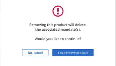 | 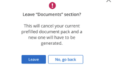 |
|---|
“I don’t know how to decide between wording like ‘Next’ and ‘Continue’, or even how to tell whether my content’s clear or not.” Lead product designer
My role was to build a content strategy and governance framework that unified these experiences, creating tools to support faster product content decisions that increased the confidence of both internal and external users.
Objective
Create a content style guide that strengthens the consistency and cohesion across our products for both enterprise (internal) and client-facing digital experiences.
Phase 1. Discovery
Audit
I reviewed more than 24+ independent internal Confluence spaces that documented content standards, design systems where I identified several issues, including:
Absent decision-making frameworks or processes
Shared terms
I also interviewed several design, product and engineering colleagues to gage their understanding of how they determine content-design decisions.
Phase 2. Define principles and success
Although I consulted my non-content colleagues, within the content design team we defined principles to ground all future content design decisions:
Principle | Objective | Demonstrated by |
|---|---|---|
Content is clear and accessible | Ensuring our users always understand what is happening, what they need to do and what'll happen next, irrespective of their context, ability or familiarity of the product. |
|
Content is not used to patch bad UX | Copy shouldn't compensate poorly designed flows, poor hierarchy or patching poor internal process. |
|
Content is grounded in evidence | Empowering content design by ensuring decisions aren't easy to refute - as each any and every content decision on data and user insights, not assumptions, opinions or preferences. |
|
Content evokes confidence | Increasing the trust of our users by ensuring they feel appropriately informed, capable and supported by the product and business in their decision-making, especially in high-stakes or sensitive moments. |
|
Content aligns with the businesses' values | Ensuring product content consistently reflects the organisation’s ethical stance, priorities and responsibilities to its clients and users. |
|
We then established success metrics: reducing support inquiries related to messaging confusion, decreasing time spent on content alignment in sprints, and improving user confidence in platform reliability.
Phase 3. Developing content standards
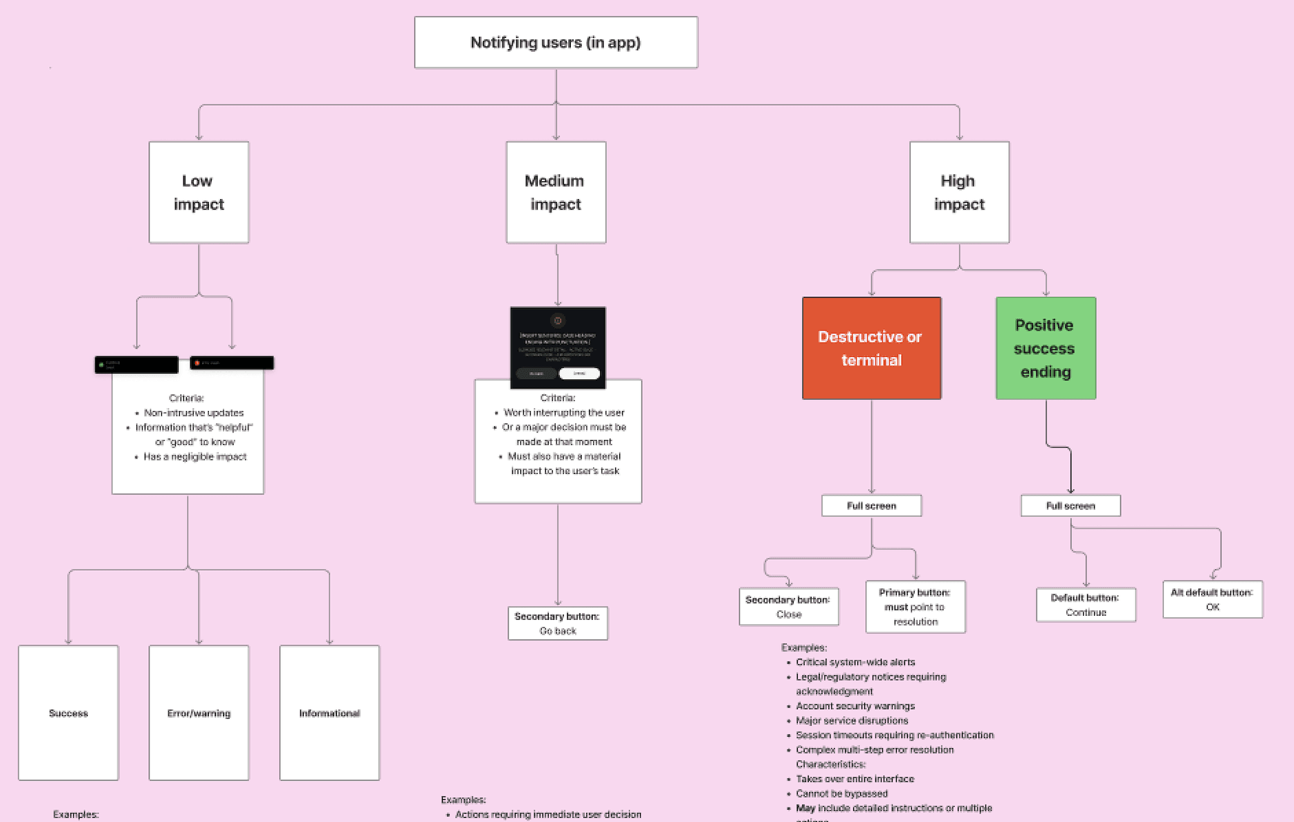
We progressively translated these principles into actionable standards. For example, creating a content framework that covered in-app notifications, for example:
To avoid overloading non-content design partners with yet another Confluence space and ensure guidance felt compelling, I uplifted existing design systems to include relevant content standards, strings and variables.
I partnered with the broader design and brand teams to ensure the new content system reflected the bank’s tone of voice and visual identity.
Phase 4. Applying content standards
Internal experiences
Before (examples of inconsistencies) | | |
|---|---|---|
After | 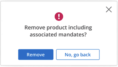 | 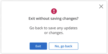 |
Resolutions | Agreed button CTA rules with design system team, with primary action always to the left. | Primary action linked to the verb Reducing verbosity of common statement "Are you sure you want to…" |
Client experiences
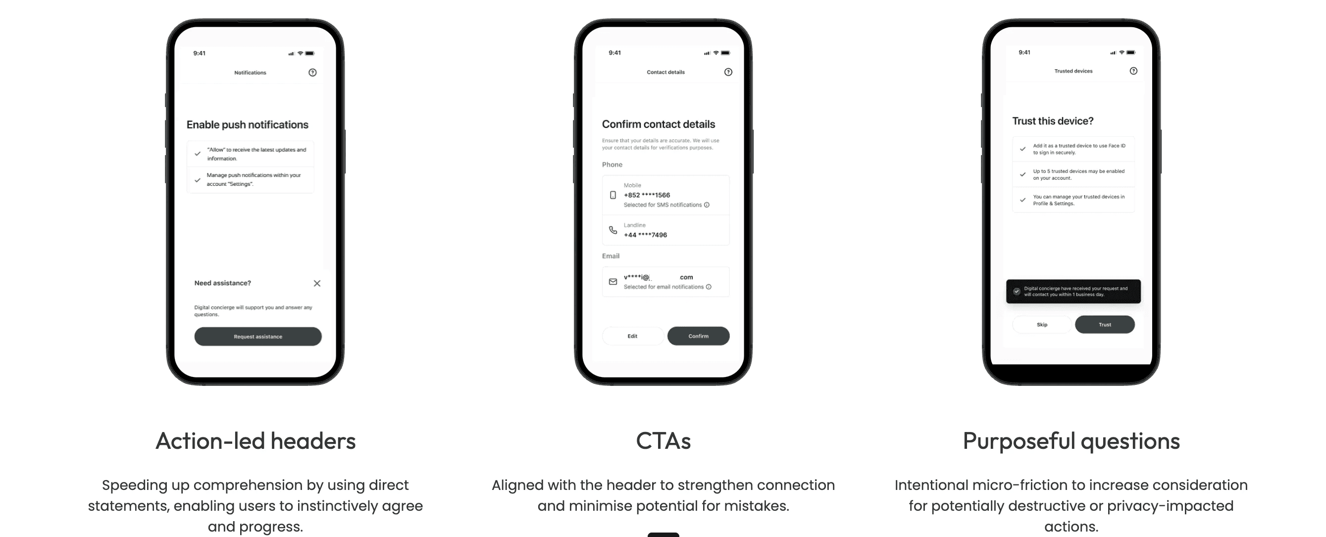
For new journeys, we were able to apply standards straight away, for example from from our first-time sign-in experiences for new private bank clients:
The problem
Fragmentation across our digital experiences were creating user friction.
In the absence of content standards, teams were inconsistent in their decision-making, resulting in users encountering conflicting content patterns across the suite. Internal support-desk data indicated that approximately 20-30% of inquiries stemmed from unclear or contradictory messaging, alongside a reluctance to transition away from legacy platforms. Advisors were also flagging an increasing number of complaints from clients, who were losing confidence in the safety and authenticity of our digital solutions.
The fragmentation also contributed to inefficiencies within the internal design process. Product teams were spending roughly 25-35% of design time negotiating copy decisions and aligning on terminology.
Examples of inconsistencies | | |
|---|
“I don’t know how to decide between wording like ‘Next’ and ‘Continue’, or even how to tell whether my content’s clear or not.” Lead product designer
My role was to build a content strategy and governance framework that unified these experiences, creating tools to support faster product content decisions that increased the confidence of both internal and external users.
Objective
Create a content style guide that strengthens the consistency and cohesion across our products for both enterprise (internal) and client-facing digital experiences.
Phase 1. Discovery
Audit
I reviewed more than 24+ independent internal Confluence spaces that documented content standards, design systems where I identified several issues, including:
Absent decision-making frameworks or processes
Shared terms
I also interviewed several design, product and engineering colleagues to gage their understanding of how they determine content-design decisions.
Phase 2. Define principles and success
Although I consulted my non-content colleagues, within the content design team we defined principles to ground all future content design decisions:
Principle | Objective | Demonstrated by |
|---|---|---|
Content is clear and accessible | Ensuring our users always understand what is happening, what they need to do and what'll happen next, irrespective of their context, ability or familiarity of the product. |
|
Content is not used to patch bad UX | Copy shouldn't compensate poorly designed flows, poor hierarchy or patching poor internal process. |
|
Content is grounded in evidence | Empowering content design by ensuring decisions aren't easy to refute - as each any and every content decision on data and user insights, not assumptions, opinions or preferences. |
|
Content evokes confidence | Increasing the trust of our users by ensuring they feel appropriately informed, capable and supported by the product and business in their decision-making, especially in high-stakes or sensitive moments. |
|
Content aligns with the businesses' values | Ensuring product content consistently reflects the organisation’s ethical stance, priorities and responsibilities to its clients and users. |
|
We then established success metrics: reducing support inquiries related to messaging confusion, decreasing time spent on content alignment in sprints, and improving user confidence in platform reliability.
Phase 3. Developing content standards
We progressively translated these principles into actionable standards. For example, creating a content framework that covered in-app notifications, for example:
To avoid overloading non-content design partners with yet another Confluence space and ensure guidance felt compelling, I uplifted existing design systems to include relevant content standards, strings and variables.
I partnered with the broader design and brand teams to ensure the new content system reflected the bank’s tone of voice and visual identity.
Phase 4. Applying content standards
Internal experiences
Before (examples of inconsistencies) | | |
|---|---|---|
After | | |
Resolutions | Agreed button CTA rules with design system team, with primary action always to the left. | Primary action linked to the verb Reducing verbosity of common statement "Are you sure you want to…" |
Client experiences
For new journeys, we were able to apply standards straight away, for example from from our first-time sign-in experiences for new private bank clients:
Next project
Designing a mobile-first onboarding experience
Objective
To uplift the onboarding experience, delivering a streamlined digital experience that's personalised and affirms confidence of prospects who've committed to becoming a client of the private bank.
To uplift the onboarding experience, delivering a streamlined digital experience that's personalised and affirms confidence of prospects who've committed to becoming a client of the private bank.